

Monday, June 2, 2008
The Brighter, The Better
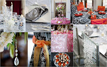
I love color from subtle neutrals to blazing brights. Color is a wonderful tool to be used to create an incredible environment whether it's in your home, office or your next party. So, I met with a wonderful couple a few days ago who is planning a summer wedding and wants bright, "wow" colors. So what colors are they using, you ask? Orange and Hot Pink! I am so loving their spunk. So how do you make orange and hot pink work with being overpowering? Temper the hues with green and soft matte gold. Take a look at the inspiration board I created for them.

Subscribe to:
Post Comments (Atom)


2 comments:
Gosh, I am loving the orange/pink combo. I first saw it pop up in an Hermes ad on the back of a magazine. I thought "how very Mumbai of them" - and sure enough.. OPI's campaign for the colors of India was littered with pink & orange. It is such an optimistic color palette, isn't it?
I like to rock mine with gold accessories... releasing my inner Indian princess ;)
Great post!
Thanks Franki! Hermes has a beautiful orange scarf with lots of pink and green in the design and if you look really closely, you'll see the outline of a man riding an elephant. Very India-inspired!
I am longing to do a Indian wedding! The parties are so grand.
Post a Comment